
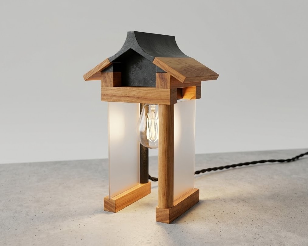
Mila is a desk lamp designed to transform a mundane everyday action into a meaningful and celebratory ritual. Switching off the lamp becomes a deliberate pause, a moment to acknowledge what has been accomplished. Mila was designed as a physical reminder that progress, no matter how small, is real and worth recognizing.
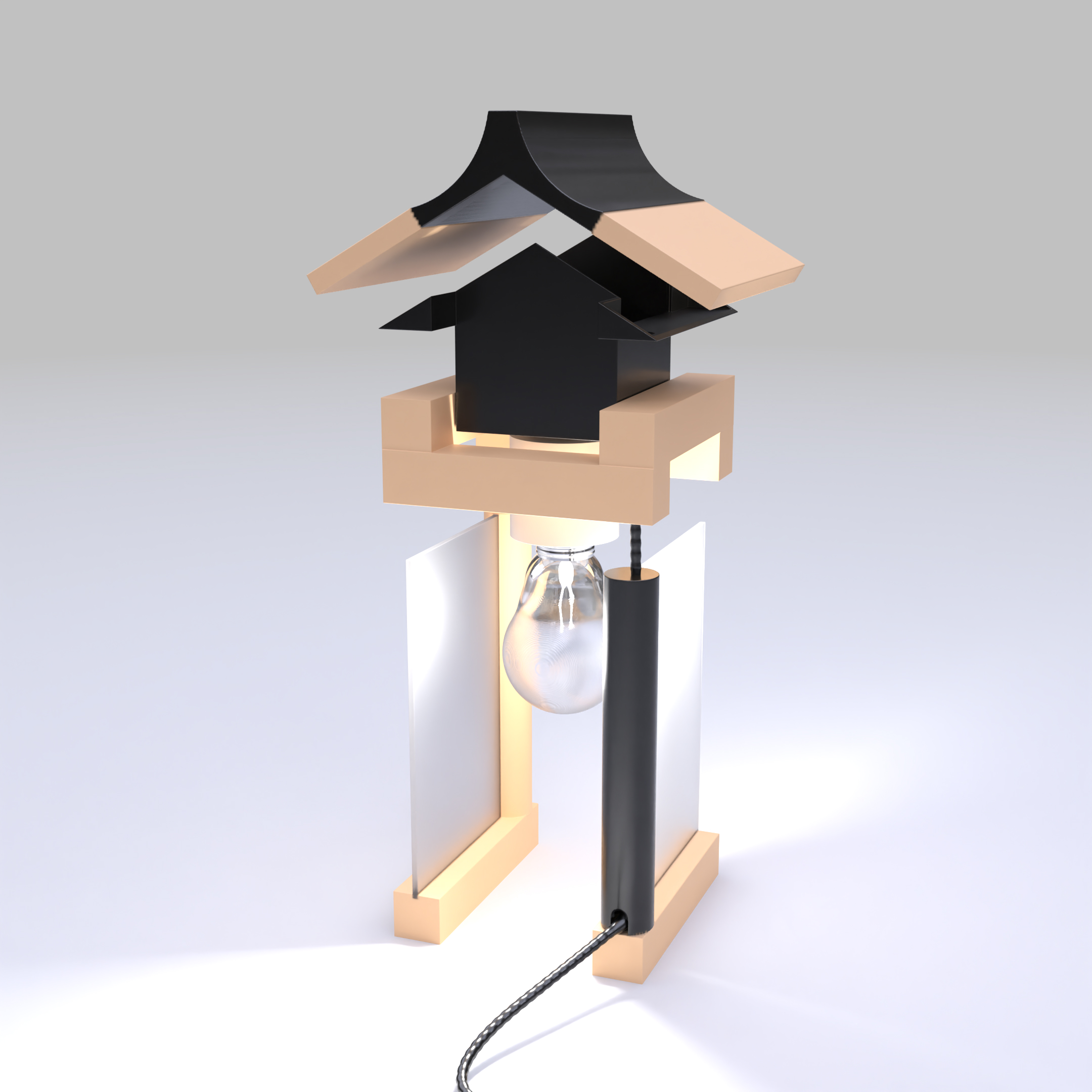

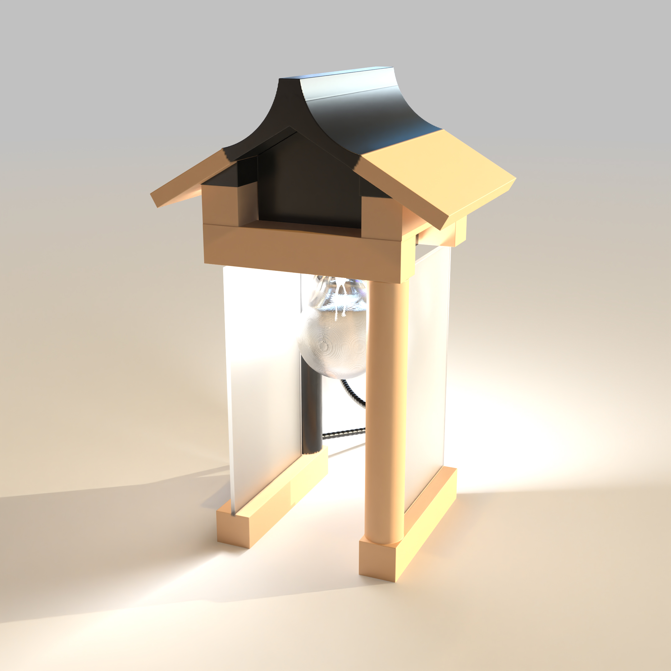
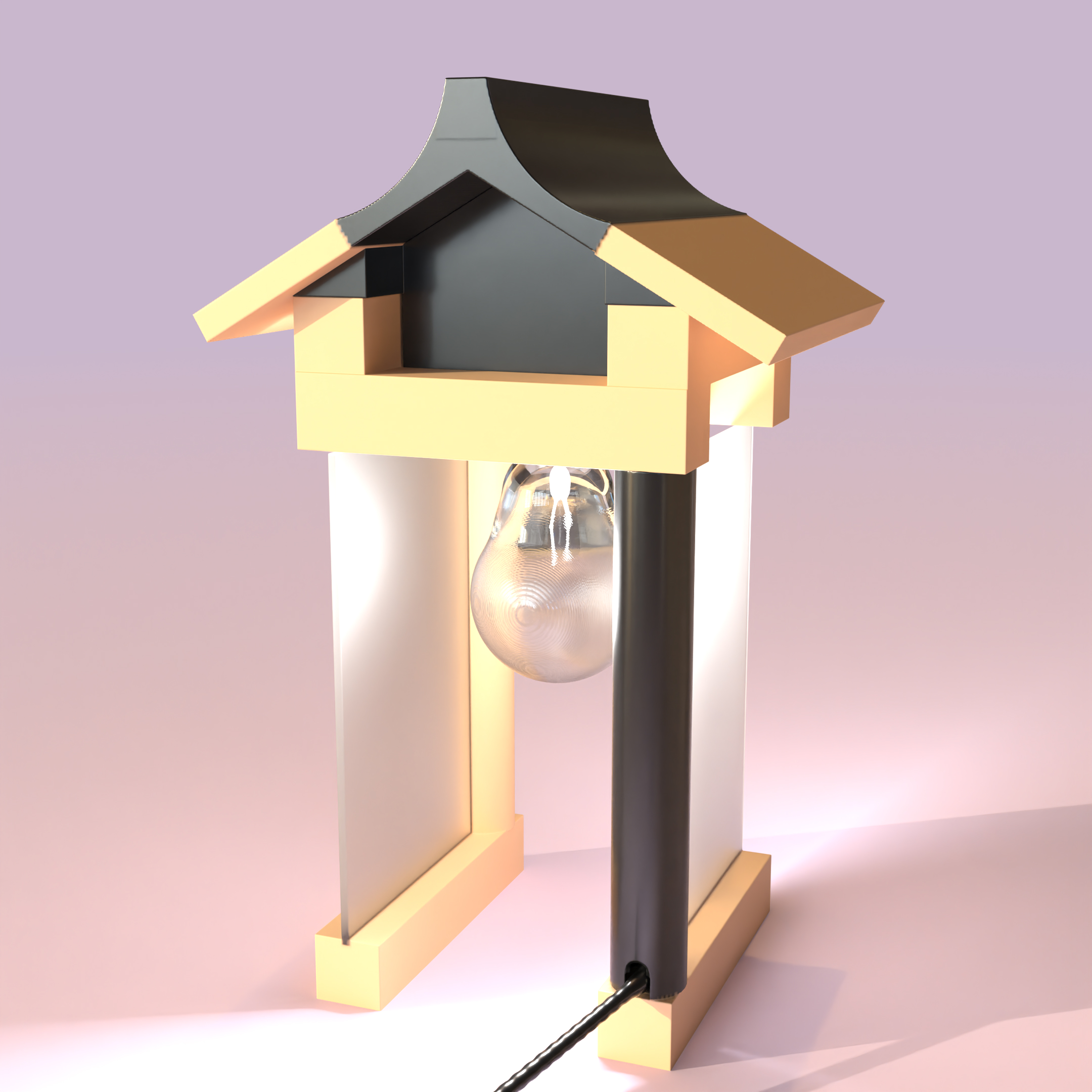
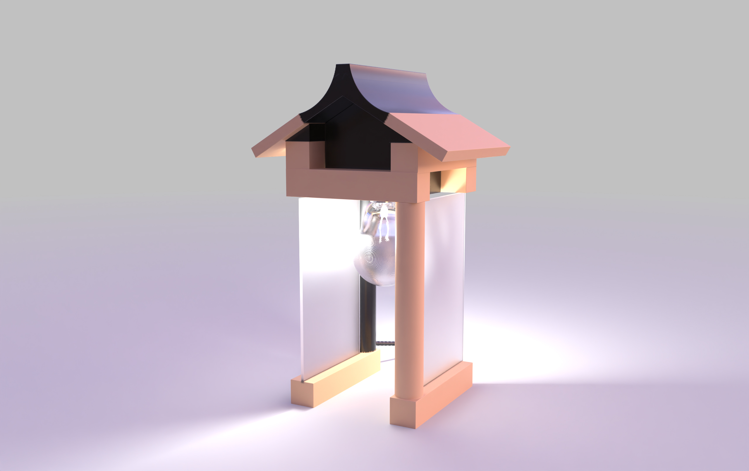
Table of contents
Backstory
The idea for Mila originated from a simple moment while playing a video game. In the game, there were designated points where progress could be saved. A quiet, reassuring markers that confirmed you were moving forward.
At a time of personal transition, I found this experience unexpectedly grounding. It made me reflect on how, in real life, progress is often less visible and harder to acknowledge.
Mila is an attempt to bring that feeling into the physical world — to create a small, everyday “save point.”
A gentle reminder that even incremental progress matters, and that every step forward is worth noticing.
Concept
There is an opportunity to design a lighting object that not only supports focus but also introduces a clear, intentional stopping point.
The design draws from two symbolic references:
– Little shine – a milestone on a journey
– Book fling up from your desk on a beam of light
Together, these ideas merge a sense of quiet achievement with a subtle, almost magical atmosphere. The result is an object that feels both calm and slightly whimsical, while maintaining a modern, refined aesthetic.
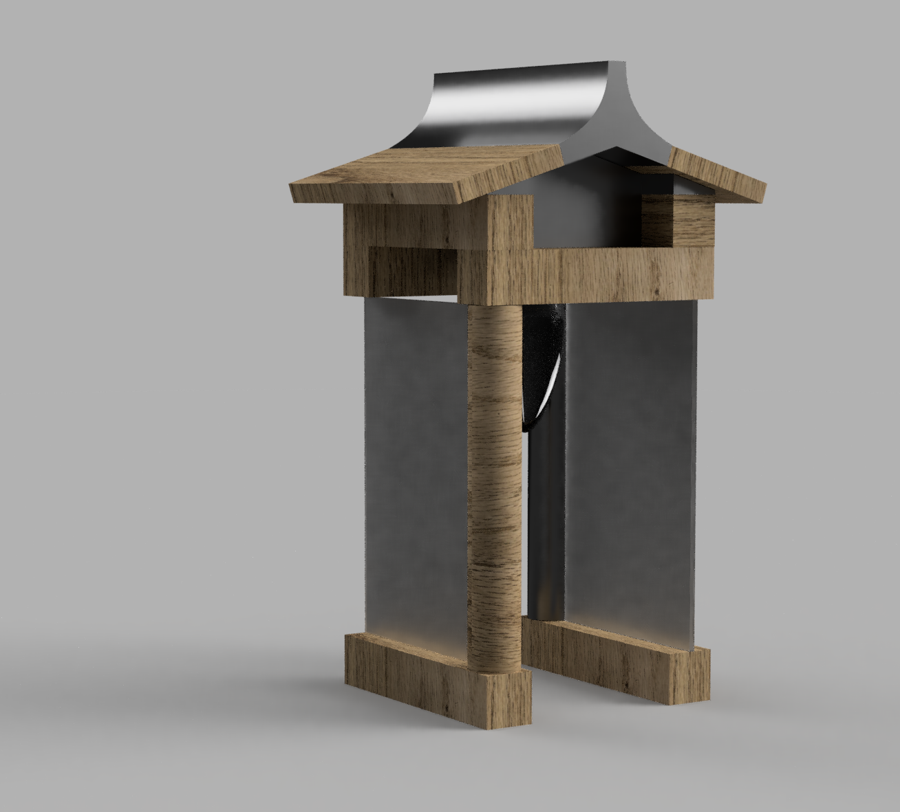
Form
The semi-open form allows the user to control the intensity and direction of light depending on their needs.
A low-positioned light source naturally directs attention toward the desk surface: righto on a notebook, planner, or a book – supporting focus and presence during work.
The roof-like structure shields the eyes from direct exposure to the bulb, creating a softer and more comfortable lighting experience.
Semi-open structure
Allows partial control over light diffusion and intensity, adapting to different tasks and preferences.
Low-positioned light source
Directs focus toward the desk surface (notebook, planner, keyboard), reducing visual distraction and supporting task-oriented behavior.
Shielded top structure
Prevents direct eye contact with the bulb, improving visual comfort and reducing glare.
Material contrast (wood, steel, glass)
Combines warmth with structural clarity, making the object suitable for both home and workspace environments.
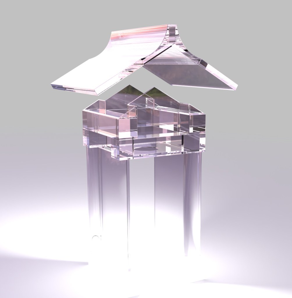
Process
The project began with early sketch explorations, followed by visual research to define the right balance between form and atmosphere.
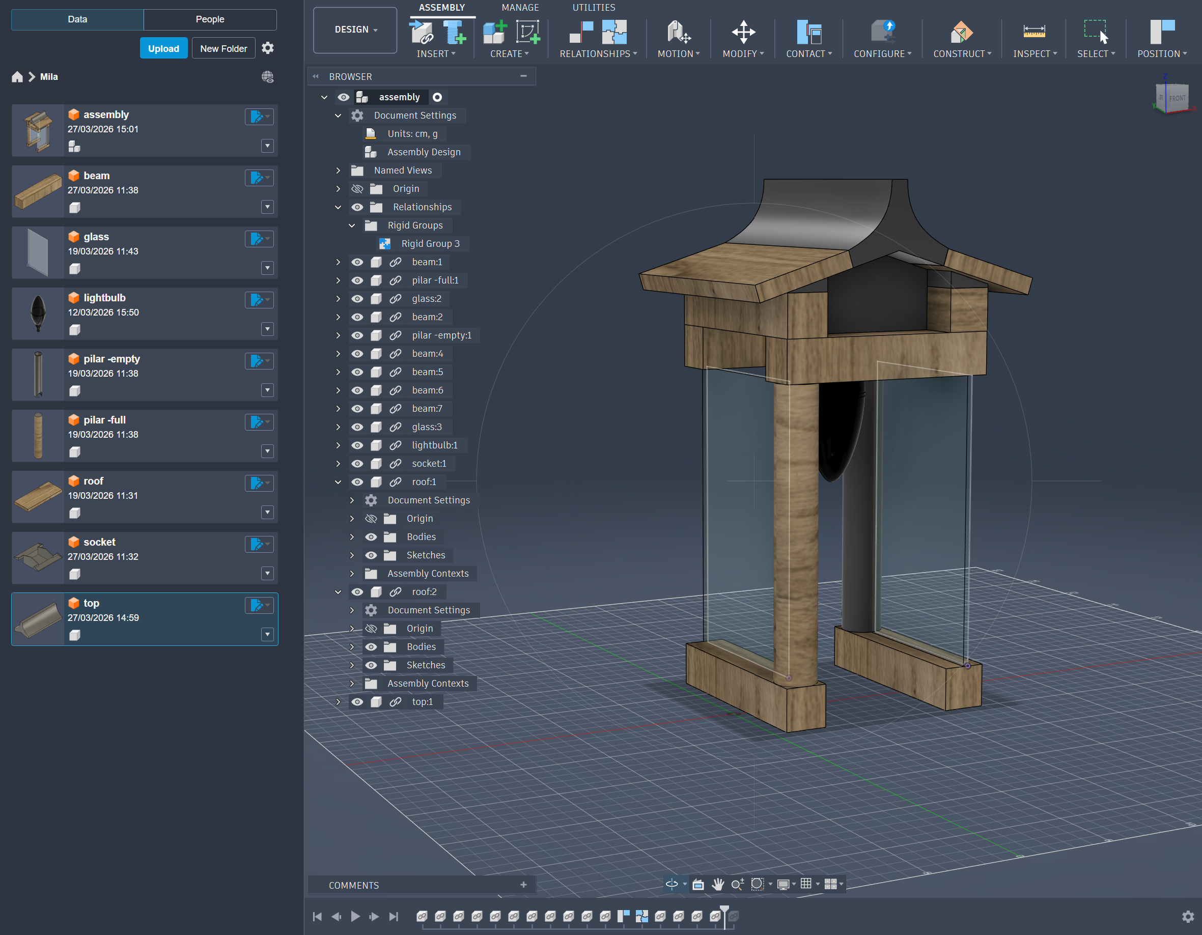
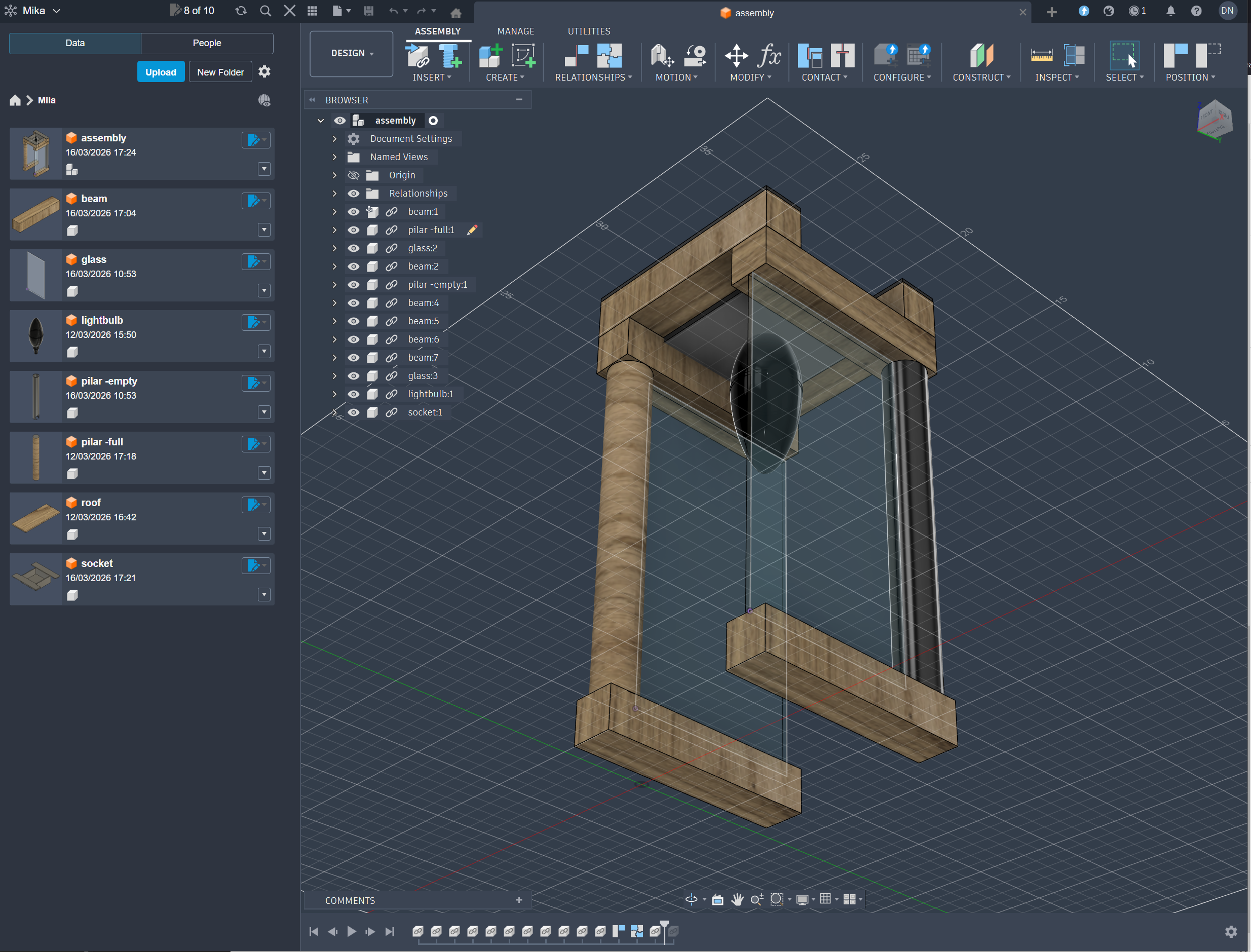
Concepts were developed through 3D modeling and iterative prototyping. The final form was refined using Autodesk Fusion, allowing precise control over proportions, structure, and material relationships. Physical prototypes were used to validate scale, material interaction, and lighting quality.
Testing concept
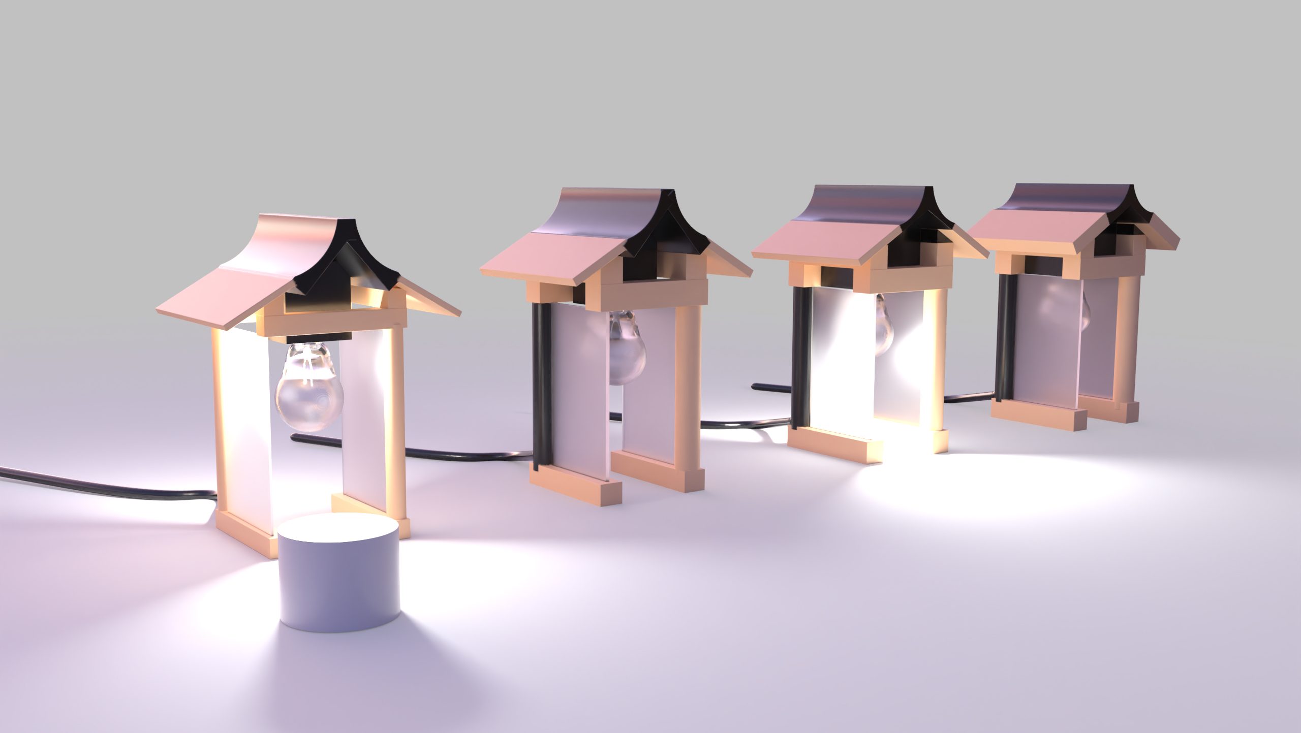
I ran a concept validation study to test whether the core idea (switching off a lamp as a deliberate end-of-day ritual) was legible and emotionally resonant.
Research questions
- Do people understand the symbolic intent of the lamp without prior explanation?
- Does the problem Mila addresses: difficulty mentally disconnecting from work – resonate with the target audience?
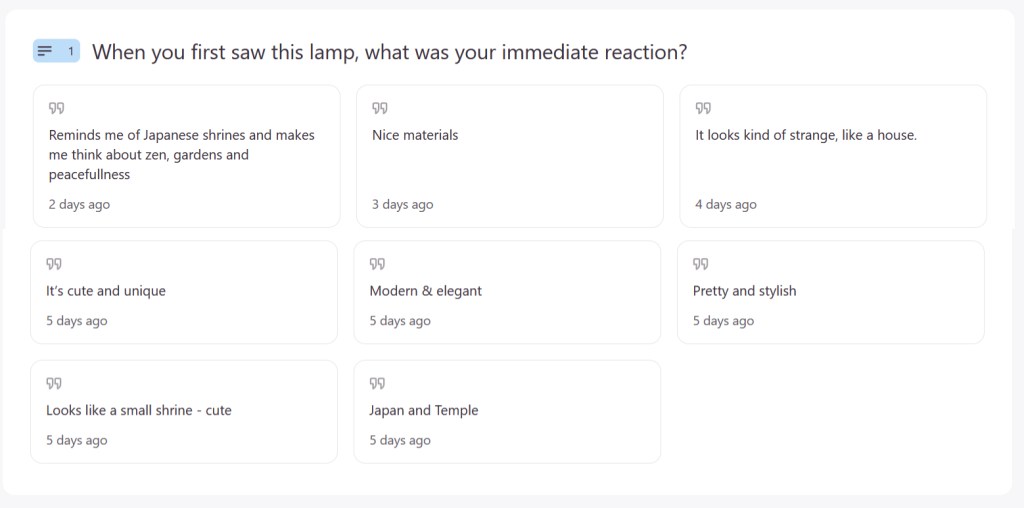
- What associations does the design evoke?
Methodology
Tool: Typeform 10-question concept survey mixing Likert scales, multiple choice, word tags, and open responses
Stimulus: 3D render of the lamp + one sentence description shown before questions began
Sample: 8 participants: remote workers, hybrid workers, office workers, and one student. Age range: 18–35.
87% understood the symbolic intent of the lamp
Key metric
87%
Understood the symbolic intent of the lamp
4.1/5
average emotional resonance with the problem space
75%
open to purchasing the object
1. The concept is legible
Insight The core metaphor is communicating effectively at concept stage. No instructions needed beyond one sentence — the form and the idea are working together.
2. Strong problem-space resonance
Insight There is a significant gap between how real the problem feels (4.1/5) and how much participants believe a physical object can solve it (2.3/5). This suggests the design challenge is not about form, but about communicating ritual — making the behavioural change feel credible, not just symbolic.
3. Form communicates calm, not utility
Insight: The form is successfully communicating stillness and intention — but not agency. Most participants read Mila as a beautiful object rather than a behavioural tool. The unexpected Japanese shrine association suggests the silhouette carries more cultural weight than intended, which could either be leveraged or addressed in the next iteration.
Implications for next iteration
- Strengthen the ritual communication: through interaction, material, or sound. Goal is to bridge the gap between emotional resonance with the problem and perceived utility of the object.
- Investigate the shrine / zen association further. Is this a positioning opportunity (calm, intentional, Japanese-influenced design language) or a misread that pulls too far from the product’s core function?
- Repeat the study with a physical prototype to test whether tangibility changes perceived utility. The object held in hand may communicate behavioural intent more effectively than a render.
- Sample size is sufficient for directional insight but not statistical significance. Results should be treated as early-stage signals, not conclusions.
