

Redesign of product page for company selling furniture.
Design needed some tweaks because clients were getting lost.
Mebloo.pl
Mebloo is a shop selling furniture and the second brand of Fabryka Sypialni.
I worked there as inhouse graphic designer
in a small department of e-commerce.
My tasks were very varied. From Graphic design (like banners for buildings and web, print materials,) through UX/UI and Web design (like redesigning and implementing website design in Shoper and Selly – content management systems specialized in e-commerce) to content creator for Facebook and Instagram pages.
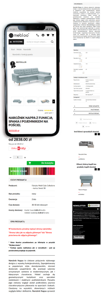
The main problem was the button for selecting colors that was not drawing enough attention. Textile selection “wybierz kolor” used to be red with little palette icon constantly moving back and forth, and would take the client to the textile selection popup.
This was not only too “noisy” and deconcentrating but also not effective. Users still had problems finding textile selection.
Another way of getting to textile selection popup is to just click on “add to cart”. This solution that makes sure no one adds product without choosing a textile. Clients prefer to be sure they know all the details before making a purchase.
It gave an excuse to rearrange whole product card to give a better hierarchy of information, and more cohesive look (with icons such as “bestseller” and “in the stock”).
For comparison here is layout before changes: https://web.archive.org/web/20180429034433/http://mebloo.pl/naroznik-nappa-z-funkcja-spania-i-pojemnikiem-na-posciel,id2230.html
Design includes:
- Rearrangement that made more sense and made most important elements easy to find
- Visual elements like textile selection, bestseller, and szybka dostawa (fast delivery)

