
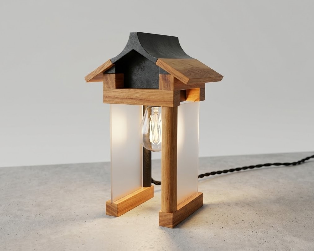
Mila is a desk lamp designed to transform a mundane everyday action into a meaningful and celebratory ritual. Switching off the lamp becomes a deliberate pause, a moment to acknowledge what has been accomplished. Mila was designed as a physical reminder that progress, no matter how small, is real and worth recognizing. Table of contentsContinue reading "Mila Desk Lamp: Celebrate Progress with Intentional Design"
Branding
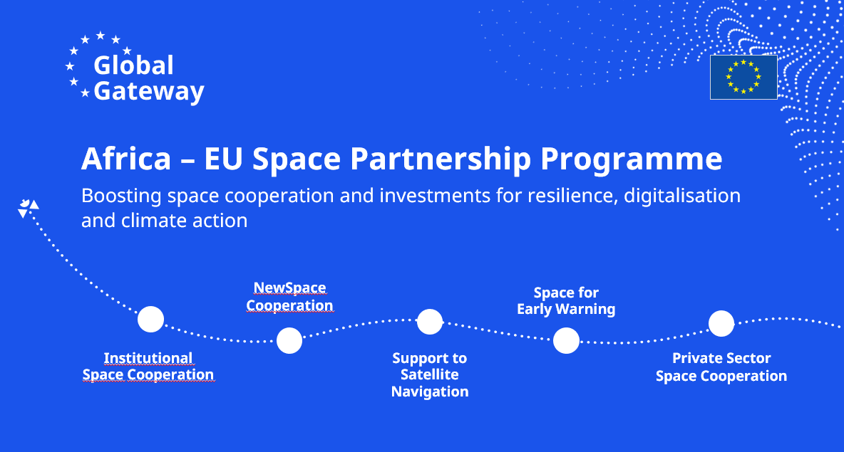
I approach branding as a system that supports product clarity, usability, and consistency across touchpoints. My work focuses on creating and evolving brand frameworks that scale with digital products, align teams, and support user trust rather than standalone visual assets. Global Gateway Goal: work across cultures and languages, scale across many sub-projects and balance politicalContinue reading "Branding"
Ponte app
Productivity app fostering human connection. Social calendar that helps you stay in touch. I want it to be a gamified experience for very real connection prioritizing keeping good habits and growing together. No Ads, no companies no people you don't know. Hakaton for hobbies In essence Ponte system adopts scrum and agile methodologies to personalContinue reading "Ponte app"
European Commission -via ICF Next
My work as Designer at Political Strategy and Communication office (INTPA02)I worked to create visually cohesive and impactful designs for both external and internal use. I ensured consistency across various digital platforms by closely following and applying brand guidelines to ensure visibility of Commissions efforts and commitments. With numerous projects spanning various sectors and audiences,Continue reading "European Commission -via ICF Next"
Bites
Digital recipe book approved by personal trainers and dietitians. One place app for nutrition, recipes and meal planning. Role: Product DesignerCollaborators: Personal trainers, dietitians, developerTools: Figma, Notion, Typeform Table of contents Concept Concept Target audience:- People looking to eat more healthy and have an control over their macronutrients intake- Patients having to manage a specificContinue reading "Bites"
Uxcel
An all-in-one product for User Experience Professionals of all levels. From Training to testing and even certificating the knowledge. Famous for its gamified approach allowing continuous learning. It features extensive designer profiles with skill graph.https://uxcel.com/ My role UI designer in education team - creating learning material for users Results: Educational content is especially sensitive toContinue reading "Uxcel"
Uxcel illustration system
I was tasked with creating a unified system for presenting humans in illustrations that are being used as part of the platforms courses.These illustrations serve as powerful visual aids throughout the course curriculum. This system ensures a consistent and unified approach to depicting individuals across various educational materials, enhancing the overall learning experience for students.IllustrationContinue reading "Uxcel illustration system"
Fabryka Sypialni
I was tasked with the implementation of a new layout of the website https://fabrykasypialni.pl/ . The old one was very outdated. The new template was acquired but it needed adjusting to the needs of the shop. Fabryka Sypialni is a shop selling beds, mattress, upholstered panels, and all one could ever want to create theirContinue reading "Fabryka Sypialni"
page A
Page A is a company delivering everything origami for events: from decorations to small workshops in Warsaw area. As this is quite a small and unique niche, the client requested a logo that could, if the need arises serve well even if focuses of the company shifts: possibly to cosmetics or workshops. See page AContinue reading "page A"
Home Care -website
A scalable website for for finding rental homes See prototype First: empathize & define I created two personas: one renting, another renter. I find that documenting personas etc. are super useful when one came back to the project to realize what kind of approaches have already been explored. An absolute crucial goal for such aContinue reading "Home Care -website"
